The Pound Coin and the rejected bird designs
25 years ago The Royal Mint decided to explore the possibility of creating a new series of reverse designs on the £1 coins to represent the four constituent parts of the United Kingdom .
Selected artists were invited to submit designs that should have a common theme and a unified style, but they were allowed a free hand in the choice of subject matter.
In a 1992 edition of ‘The Medal’ magazine, Marina Warner – a writer and member of the Royal Mint Advisory Committee – revealed that there were two finalists in the competition and wrote “Designer 9 produced an elegant series of sketches that were in positive danger of producing pleasure“.
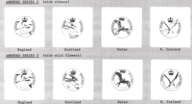
The designs, by Mary Milner Dickens, featured the avocet for England, the osprey for Scotland, the red kite for Wales, and the roseate tern for Northern Ireland. Each had been close to extinction earlier in the century but had made a successful breeding return. Designer 8, meanwhile, “submitted a series of ploddingly traditional heraldic schemes“.
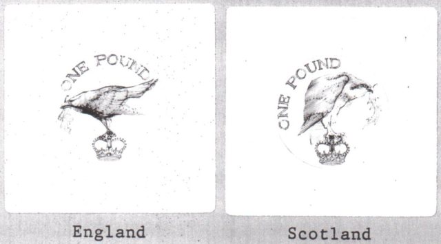
The first sketches show each national bird perched on a crown. The bird representing England appears to be a crow, but this was changed to an avocet in subsequent sketches.
Later sketches show each bird sitting on a national plant (oak branch, thistle, leek and flax respectively) and another variation shows the same designs but with a crown separating the words “ONE POUND”.
In later designs Mary Milner Dickens showed the birds in flight. One version shows each bird above a map of a pertinent national river, while the other variation shows essentially the same design but with the rivers replaced by flowers. Both versions depict a relevant national crown for each design, rather than simply portraying St Edward’s crown in each case.
However, there was a conflict of interest.
In 1993, Norman Lamont (Chancellor of the Exchequer and ex-official Master of The Royal Mint) caused dissent amongst The Royal Mint Advisory committee by overriding a decision usually made by them. In a statement by Mr Anthony Nelson (Economic Secretary at the Treasury) he told members that Mr. Lamont “just does not like birds” and was consequently opting for the heraldic design.
This decision sparked outrage leading to the resignation of Marina Warner, a member of the Committee at the time, who accused the Chancellor and his officials of rejecting the designs because of the idea of innovation itself in the iconography of the coinage.
The Royal Mint documents do not reveal the details of the discussions, stating only that there was a “full and frank” discussion.
So instead of the 1994-1997 heraldic £1 coins designed by Norman Sillman (designer 8) that we are so familiar with today, we could have had four completely different £1 designs in our change.

The heraldic £1 coin designs from 1994-1997 that represent the four constituent parts of the UK designed by Norman Sillman
At the time Mary Milner Dickens had already designed the 1992 EC 50p and she later went on to create the reverse designs of the Libraries 50p in 2000 and the Queen Victoria £5 in 2001.

Mary Milner Dickens also designed the 1992 UK EC Presidency, 2000 Public Libraries 50p and the 2014 Queen Anne £5
As the 1990’s progressed, the designs of commemorative 50p and £2 coins became more boldly innovative. The national bridges that featured on £1 coins between 2004 and 2007 were distinctly non-heraldic – and no-one objected.
Credit: First published in Coin News – this article was written by Philip McLoughlin and researched by Dutch numismatist Niels van Schendel.


I got in my change a new £5 note but it has got something on which the others have not I do have a photograph but it does not give a true recording of it it looks like the letters on the front are reflected on the back we have look at other £5 notes and have not seen this what would be the best thing to do
are there any new 12 sided coins dated 2016
Hi Matthias, have you read our blog about the 2016 dated £1 coins? – https://blog.changechecker.org/2017/03/31/why-the-2016-1-coin-is-about-to-become-the-latest-coin-collecting-myth/